
Connecting Clients With The Right Designer For The Job
When Decorist clients begin design projects, we match them with a designer that fits their project needs. Getting this match right is a significant driver of customer satisfaction. The existing process was manual, and relied on inconsistent, anecdotal knowledge. We sought to improve the matching process to increase accuracy and efficiency, therefore increasing customer happiness.
Role
UX & UI
Platform
Responsive Web
Company
Decorist
*our parent company, Bed Bath & Beyond, made the decision to close us down during a reorg in 2022 - but you can check out some snapshots via the Internet Archive here
The Problem
In researching the issues that affected customer happiness (and therefore their likelihood to purchase product from us), we found that designer assignment was an area where we could improve both process and accuracy.
Discovery
There were some complex operational processes in place, involving a variety of tools and manual steps. The first thing to do was map all of this out so we had a complete picture. We shadowed the Interior Design Operations team as they completed the matching process, and conducted interviews with them to better understand the ‘whys’ behind their actions, what they found frustrating, and what they felt would improve the matching process.
Although the existing process was largely ‘off-platform’, we were able to gather some quantitative data. Statistics like average “time to assign” (the time elapsed between when a client submitted their project and a designer was matched with them), and “reassignment rate” (rate at which a new designer had to be assigned to better meet the client’s needs; and an indicator for overall client satisfaction down the line).
One of the most important takeaways from this stage was in regards to automation. While we knew that this process could be made much more efficient, and hopefully more accurate, by automating it with an algorithm, there was significant hesitation and distrust in the idea. Taking this into account, we developed a phased plan that would gradually introduce automation in a way that would give the operations team oversight and override capabilities. Not only would this help us build confidence within the operations team and business, it would allow us to improve the algorithms with their input over time, and lead to a better/more accurate fully automated feature down the road.
At this stage the PM I was working with took the lead on mapping out the logic for the matching algorithm, and with a list of prioritized use cases I was able to begin working on wire framing.
User Journeys & Wireframes
The quantitative data showed us that a significant amount of our projects were taking longer to assign than we would like. And the number of reassignments due to designer mismatches also had room for improvement. Our user research showed us that our admins were overwhelmed and needed a simple tool that provided easy access to the designer information, client information, and project information that they needed to complete a match.
I started some explorations of how all of this information might come together in a single source. Even though consolidating it all into one place would be beneficial overall, it meant we had a lot of data to show the user, and how we displayed what data and when would be important so that we didn’t just trade one form of overwhelming (too many tabs/docs) for another (too much varied information to easily parse).


We gathered feedback on these initial explorations from the operations team. They responded the best to versions where they would be able to compare project and client details side-by-side with designer details (rather than versions that would open designer information in full screen views or modals). Reviewing with them at the wireframe stage also brought up some great new ideas that hadn’t come up in our initial brainstorms. Since we were looking at abstract visuals, they started to fill in for themselves what other data points could be useful for them in those views (ex: “Oh, it would be awesome if we could see a client’s project history here!”). This was all valuable feedback we were able to take into the design phase.
Designs
The matching page displays relevant client information, project details, and the designer suggested by our matching algorithm. This consolidated the many sources of information admins previously had to consult, ensuring they had easy access to all the context they need to assign a project.
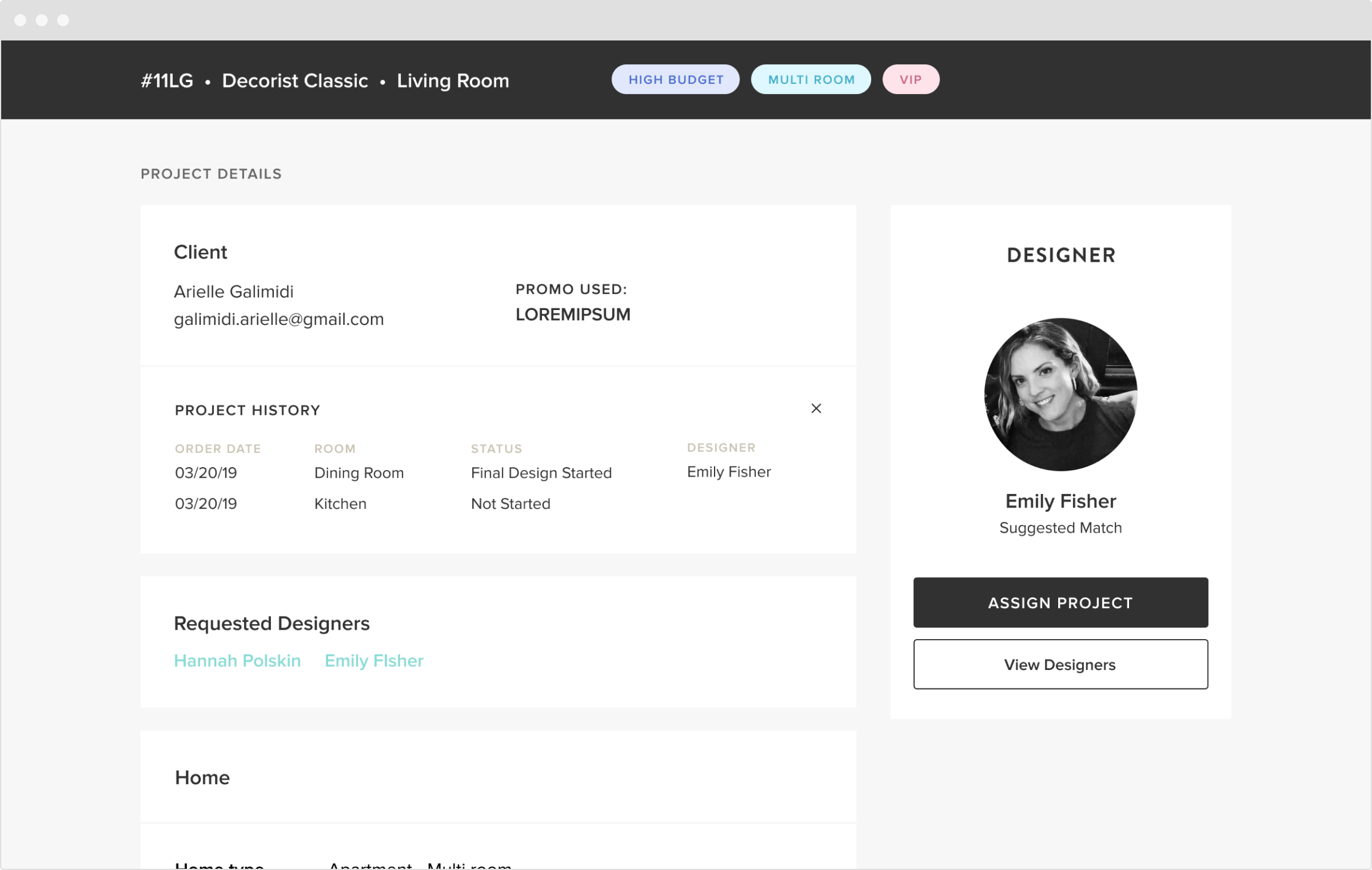


An admin can choose to view other available designers on our platform if they think a different match should be made. Selecting “View Designers” opens a drawer where the admin can search and filter designers, while comparing the results with the client and project information to the left.

Above are examples of the designer block showing possible states of a project (based on possible outputs of the algorithm, and actions an admin can take on a project).

We worked closely with the operations team to roll out the new tool, and ensure they were comfortable with incorporating it in to their daily workflow. This gave us the chance to identify and fix some bugs that had made it through the initial QA , and to make some last minute adjustments.
There was one particular workflow we caught at this stage, and decided to build a quick feature for at the last minute. In some instances, an Ops associate would decide to override the suggested designer and match a different one to the project (this in itself wasn’t unexpected since we had decided to retain the human oversight over the matching algorithm). We noticed two things: first, this was happening a little more frequently than we had anticipated, and second, the Ops associates were recording the reasons on their own each time in a document or spreadsheet. These reasons fell into some easily organized categories, and we realized this was an opportunity to collect structured feedback that would help us improve the algorithm over time. We designed a quick flow that would allow the associate to record the ‘reason code’ as part of their workflow in the tool. This accomplished a couple things for us that made it worth the scope creep - it meant we kept on track with our initial goal of reducing the number of tools/documents the associates needed to access while matching, and it also meant we would be recording consistent and easily reportable data. We could also apply this same workflow if a designer had to be reassigned later on during the project workflow.
Results and Learnings
Post launch, we were able to track some promising improvements in our matching metrics.
First, we saw “time to assign” decrease 25%. Not a huge number, but it was going in the right direction - and we knew we had a lot we could improve on from our MVP. This was also measurable data that told us that our goal of making the process for time efficient was being met.
Our customer happiness ratings were steadily improving as well. While it would be difficult to tie that to any one feature or initiative (many things factor into that rating decision for customers, and ours was not the only product/process improvement being rolled out), it was a positive indicator for us.
When it came to “reassignment rate”, we actually didn’t see any significant immediate changes. So we clearly had more work to do to improve the accuracy of our matching, and more to learn about about how reassignments could be avoided. Luckily, we were now collecting reasons for reassignment in a reportable fashion - so we could make well informed decisions about how to prioritize that work.
Overall, this was a successful MVP roll out of a brand new, and totally custom built tool for our Operations team. They were excited to use it, and we were even more excited to tackle the work of optimizing it for them as we continued on the roadmap to full automation.